illustrator,aliartcher Details
Intro
Class Intro
Illustrator,
AliArtcher
"We'll go through the process with intention, so you can maintain your creative flow and create art with a distinct, polished appeal!"
Fantasy-Inspired Character Portraits With AliArtcher
Interested in fantasy-inspired character portraits? Be ready to start your career in portrait design with AliArtcher’s expert guidance.
Start your journey into dark, chaotic, yet tender, ethereal atmospheres to shape character portraits with clarity. Through structured guidance on polishing and rendering your own character portrait, with helpful references and tools, AliArtcher emphasizes the power of emotion to sharpen your eye for visual aesthetics and create believable, visually appealing portraits.
Structured learning matters more than raw talent. This course builds visual thinking, harmoniously constructed features, and intentional shape language to create mood and personality. You’ll build a structured workflow to refine your final piece. By the end of the class, you’ll be able to apply core portrait principles long term, not just to a single finished work.
Structured learning matters more than raw talent. This course builds visual thinking, harmoniously constructed features, and intentional shape language to create mood and personality. You’ll build a structured workflow to refine your final piece. By the end of the class, you’ll be able to apply core portrait principles long term, not just to a single finished work.
Class Perks
Special Gift from AliArtcher
-
 Instructor's Personal Brush SetSketch, custom hard round, and texture brushes used throughout the course.
 -
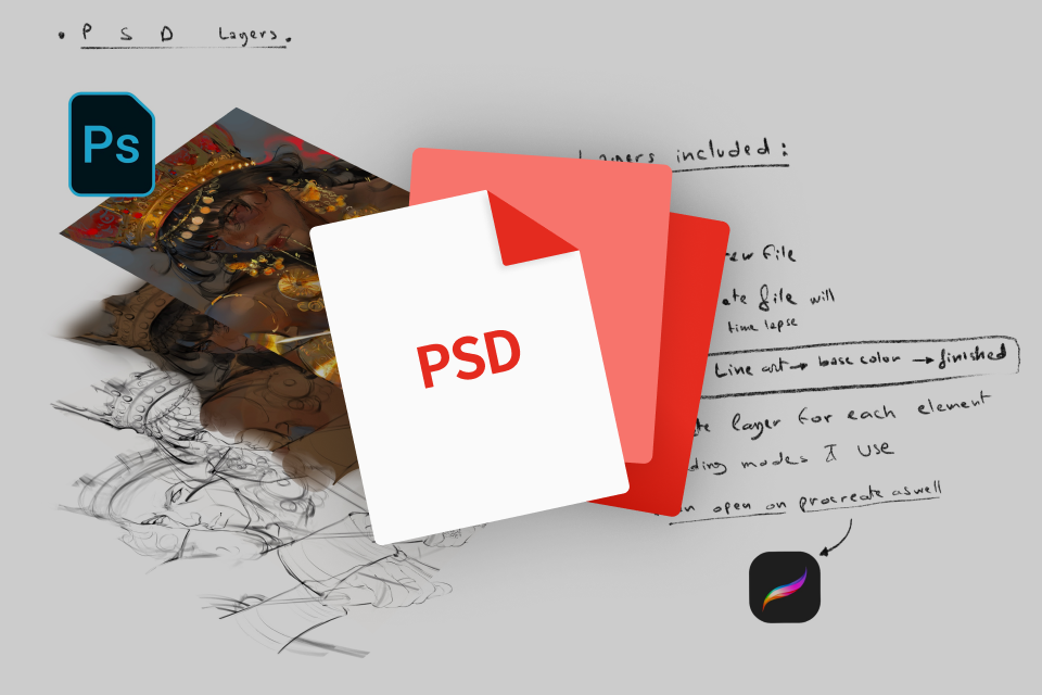 Full Layered PSD Files of Final PortraitsOriginal working files with the instructor's full workflow, from base to final polish.e for in-depth study.
 -
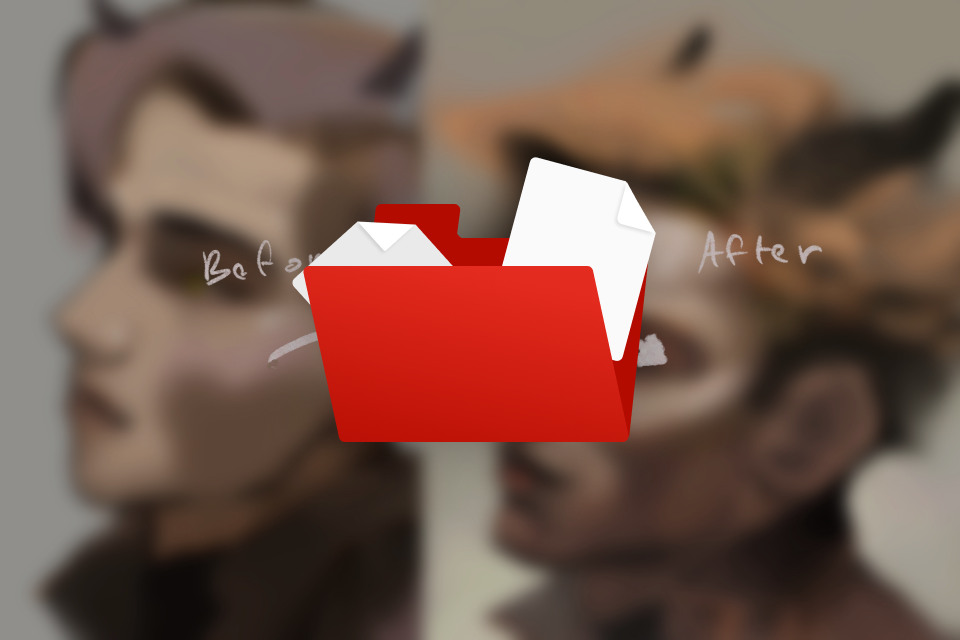 Before-and-After Comparison FilesLayer-by-layer comparisons showing what changed with each paintover stage.
 -
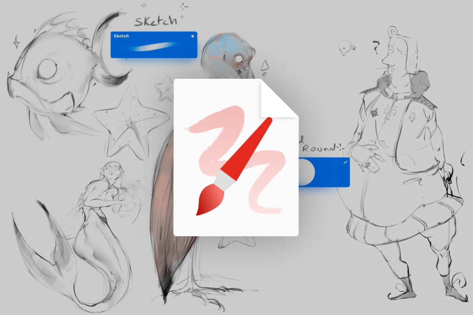
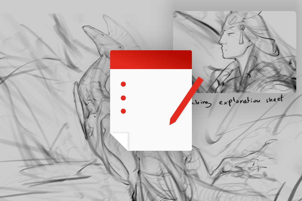 Sketch Phase Exploration SheetsVisual sheets of the progression from rough sketches to final sketch.
-
 Process Notes Explaining Decisions at Each StageWritten explanations of the key decisions and thought process behind the workflow.
 -
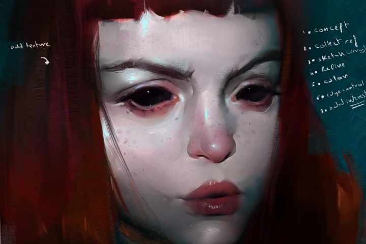
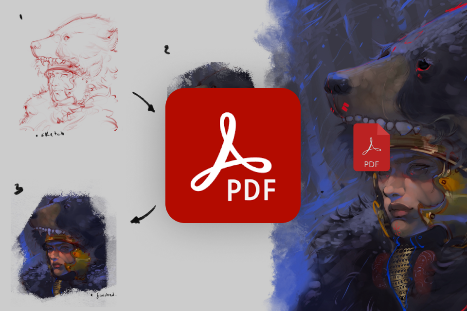 Step-by-Step Breakdown PDF of Your WorkflowA concise 6-page PDF that walks through the process with clear techniques only, no theory.
 -
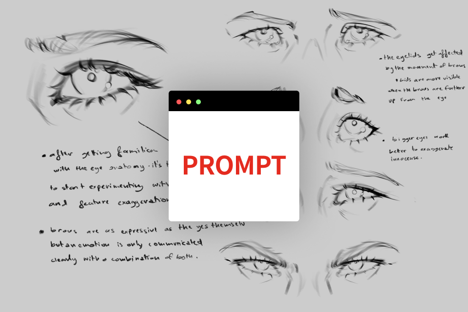 Emotion-Based Portrait PromptsA set of prompts to guide your next drawings and help you apply what you learned in the course.
 -
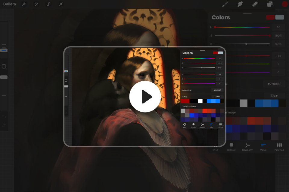 Timelapse Videos of the Entire Painting ProcessA 7–10 minute MP4 timelapse showing the painting process from start to finish.
Recommendation
Who should take this class?
Aspiring Digital Illustrators who want to start developing character design, coloring, and stylization skills through approachable methods.
Creators who want to monetize their skills in commissions and social media, and build an efficient, consistent workflow for producing content.
Fantasy / Concept Art Enthusiast drawn to grotesque fantasy and character design who want inspiration, stronger storytelling, and clear guidance for building compelling characters.
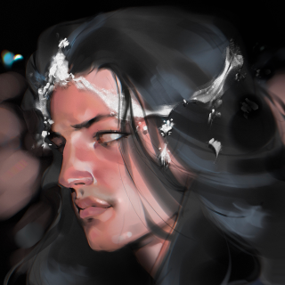
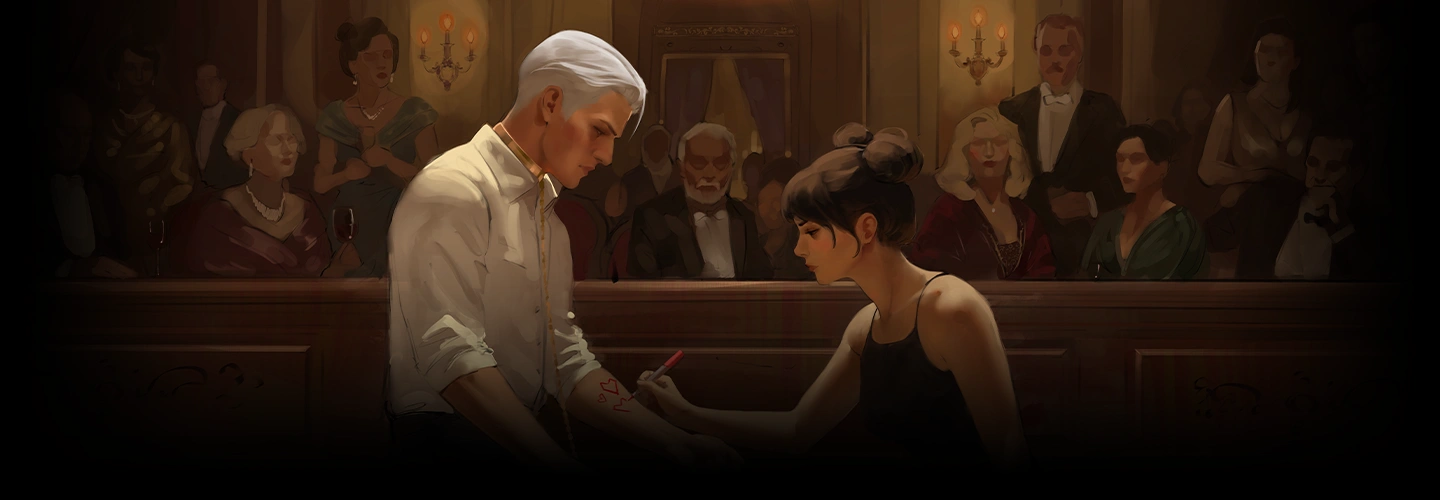
Expert Illustrator AliArtcher 's Portfolio
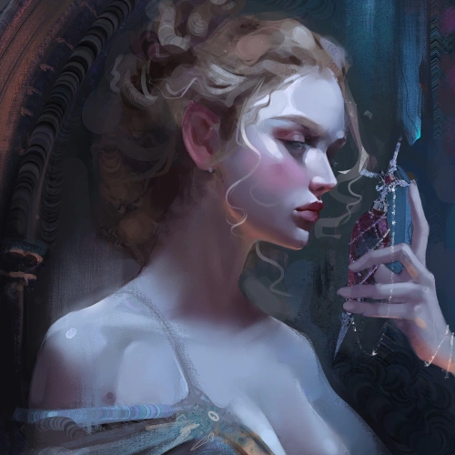
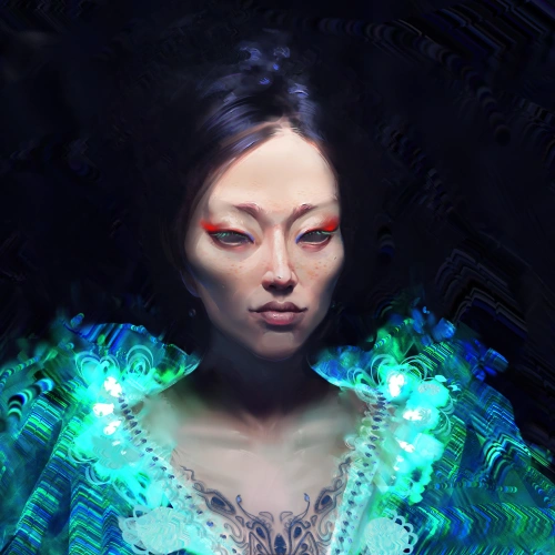
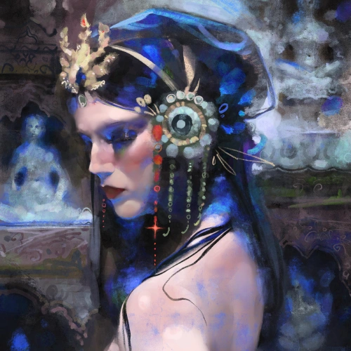
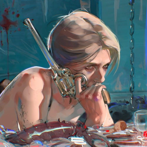


* This Portfolio includes fanart and client works.
Why Take This Class?
You don't have to worry about your artistic background. This class gives you a clear path for where to start, what to focus on, and how to reach a polished finish. Led by AliArtcher, a self-taught fantasy character artist, the course is structured to guide you from fundamentals through rendering your own completed character portrait.
This class is unique in how it balances the technical and emotional aspects of character portraiture, so you learn not only how to render, but how to create portraits that feel alive.
You will analyze and repaint an older artwork, then create a finished portrait from scratch, building a workflow you can reuse for long-term growth.
As you follow the course, you will see clear progress and feel rewarded by how far you have made in your artistic journey.

Get Ready for the Real-World
15 Class Exercises
-
 Line Confidence and FlowBuild confidence by starting with free, expectation-free lines, then find shapes through your linework. Use pressure sensitivity to control line weight, strengthen line control, and loosen up your hand with no-pressure, messy sketches.
 -
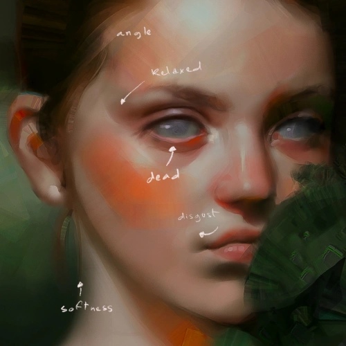
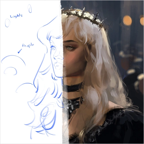
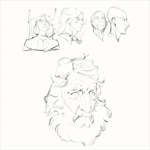
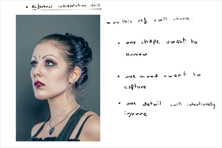 Reference Interpretation DrillChoose one reference image and define your focus by identifying a key shape to use, the mood or emotion to capture, and one detail you will intentionally ignore.
 -
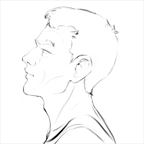
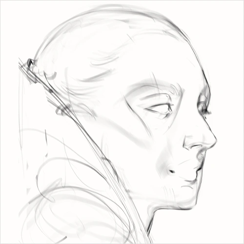
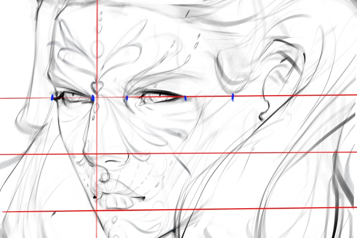
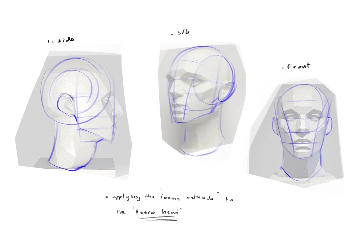 Applying the Loomis Method to an Asaro HeadApply the Loomis Method to the Asaro Head to strengthen your understanding of head construction.
-
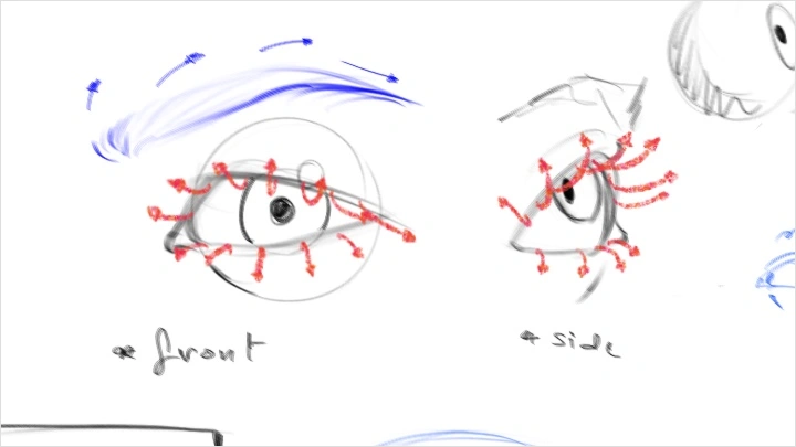
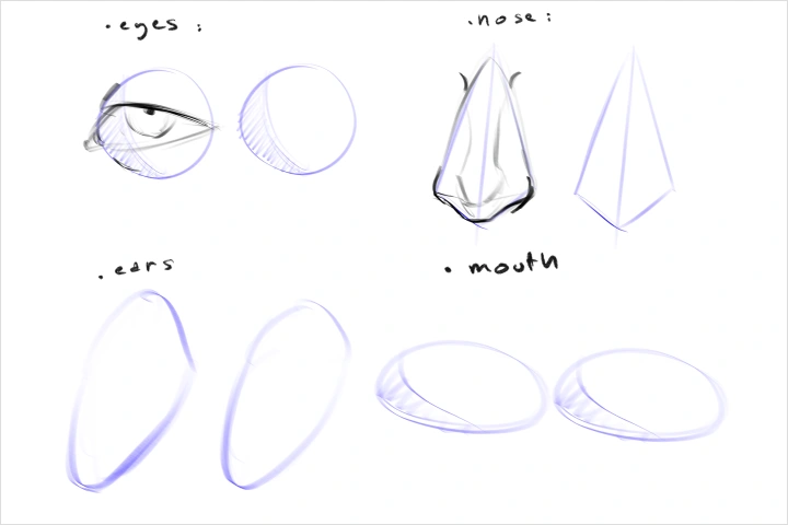 Facial Features as Basic ShapesLearn to simplify facial features into basic shapes to build stronger structure and improve portrait accuracy.
 -
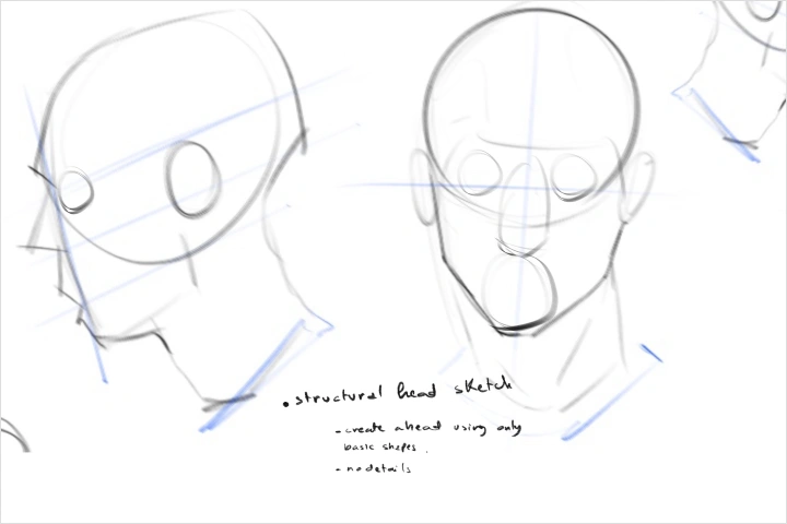 Structural Head SketchCreate a simplified head study using only basic shapes and planes to strengthen your understanding of structure and proportion.
 -
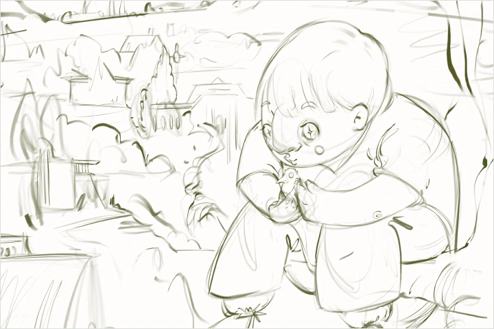
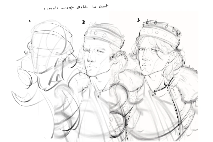 Clarity-First SketchCreate a rough sketch to establish clear forms and direction before refining.
-
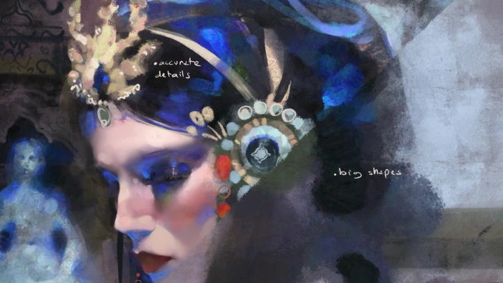
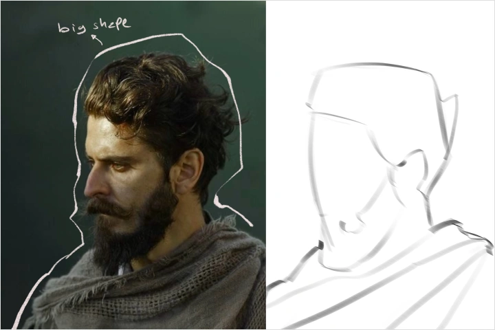 Learning to See the Big PictureTake multiple reference photos and outline the major shapes to train your eye for overall structure.
 -
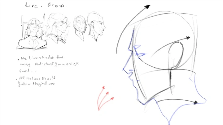
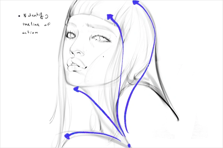 Seeing the Line of ActionIdentify the line of action in each photo to capture stronger flow and movement.
 -
 Directional Shape LockChoose a simple subject and design with intention by setting one dominant direction for the major shapes, one supporting secondary shape, and one shape to keep the overall flow consistent.
-
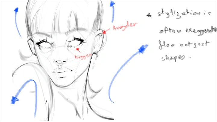
 Stylization LockChoose one feature to exaggerate and one area to simplify on the portrait sketch, then keep those choices consistent across the entire face.
 -
 Read Before DetailCreate one planned sketch by blocking in big, simple shapes first, choosing where to add complexity, refining negative space, and adding smaller forms only when they enhance clarity and focus.
 -
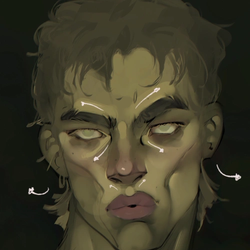
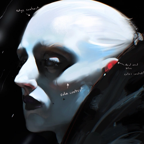
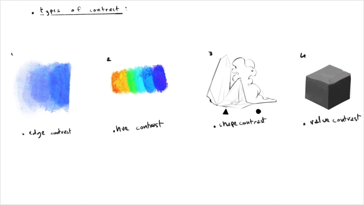
 Contrast CheckConvert your portrait to grayscale to confirm clear values and a strong focal point, then refine as needed before continuing.
-
 Light With IntentLearn how to establish a clear light source and apply it through plane-based shading to keep your lighting consistent and readable.
 -
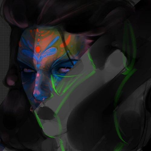
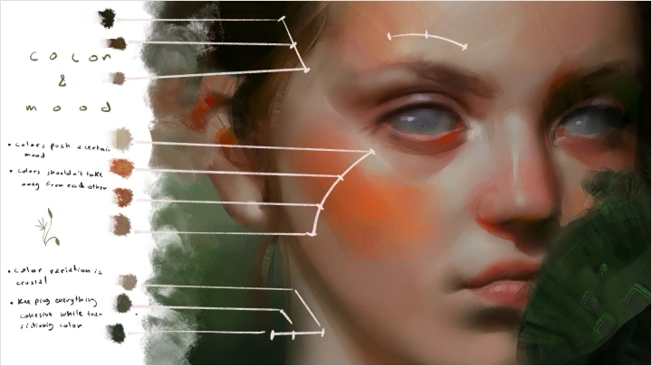
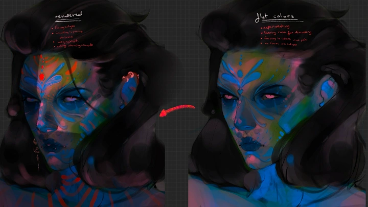
 Color Without BlendingBuild expressive, lively color with a limited palette and intentional hue and saturation shifts, keeping the finish purposeful and rough, making an intentional transition in colors.
 -
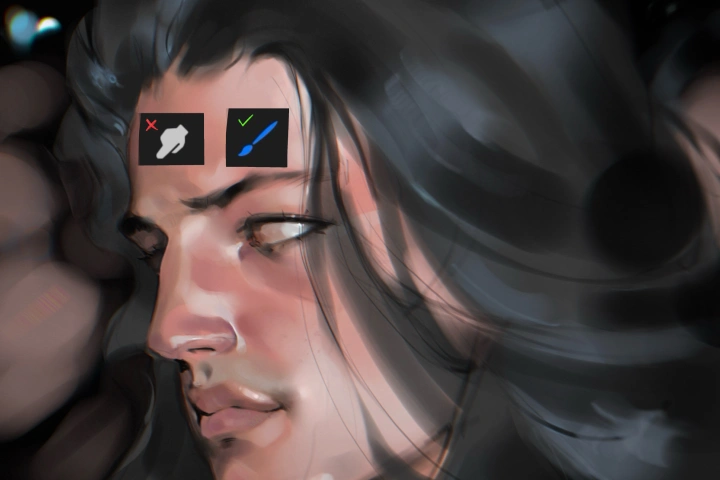
 Final PolishBring your portrait to a professional finish by sharpening clarity and focus through selective refinement, subtle contrast tuning, and clean, intentional edge control, so the image reads strongly both up close and at a glance.
Final Product Examples
-
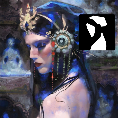
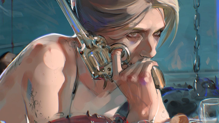
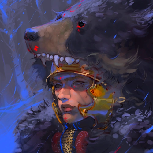
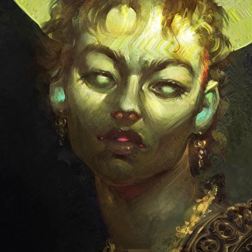
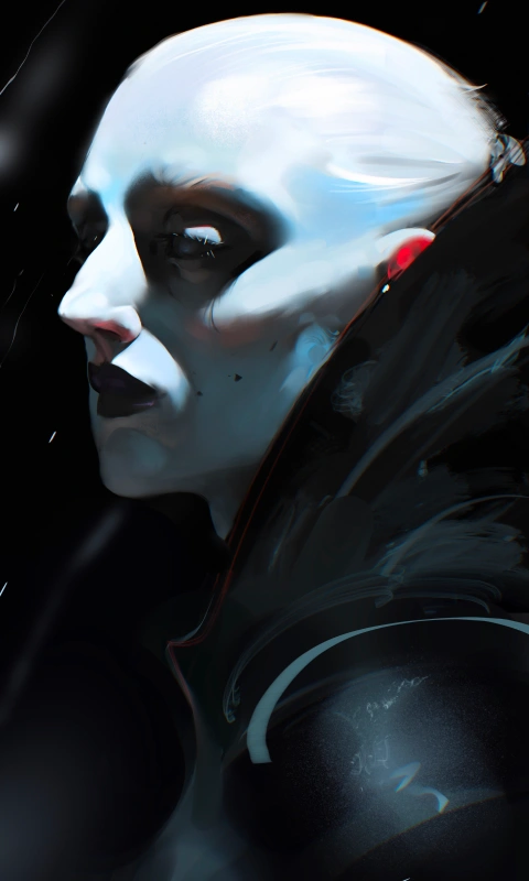
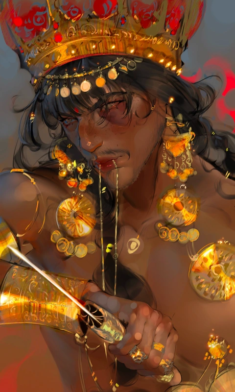
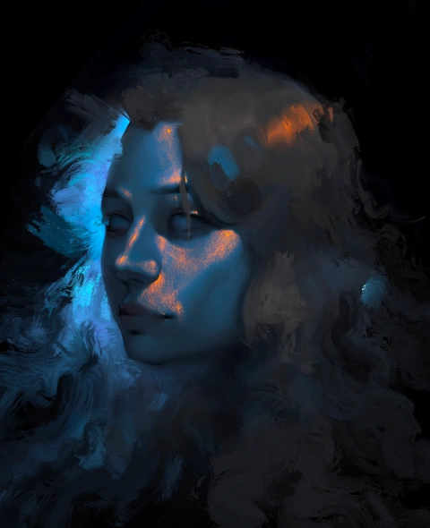
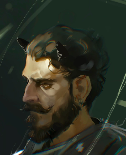
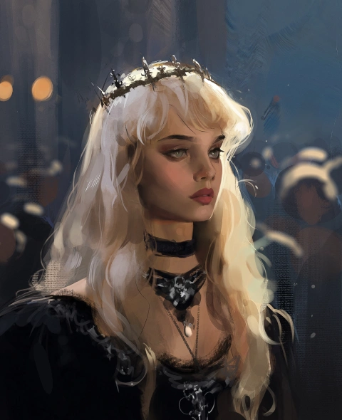
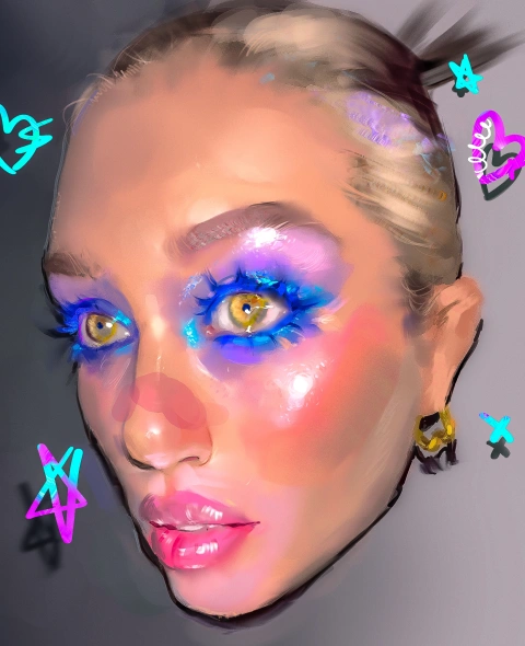
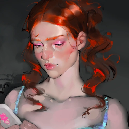
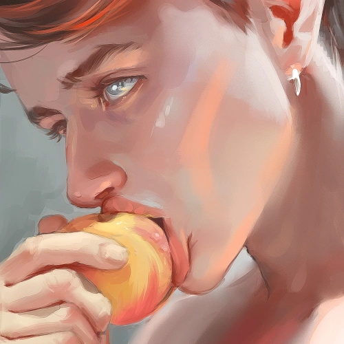
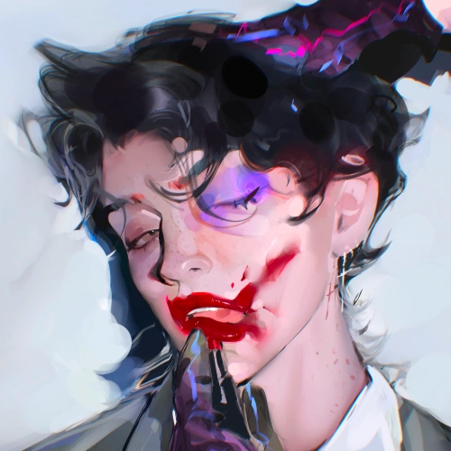
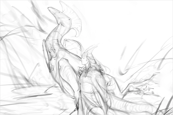
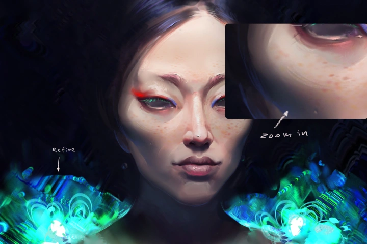
 Rendered Character Illustration
 -
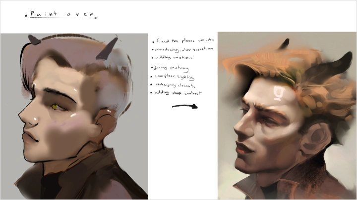
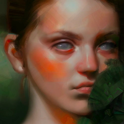
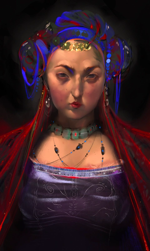
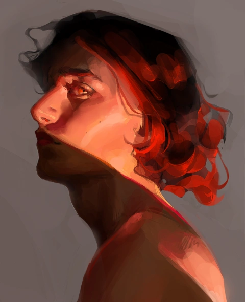
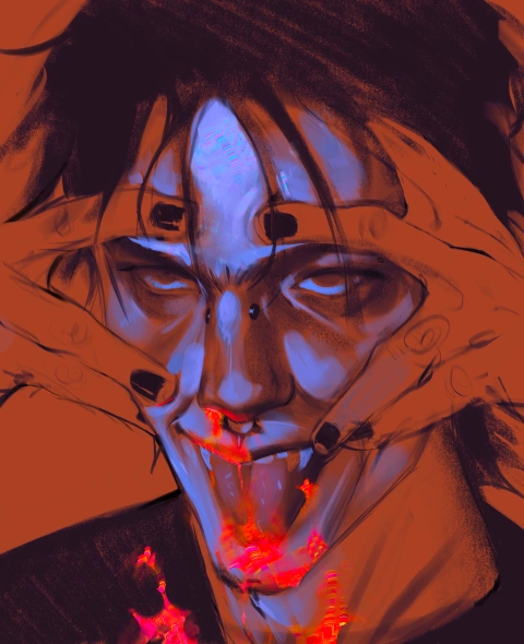
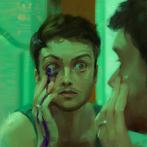
 Refining Older Artwork
*The above images are sample images for a better understanding.
Highlights
Class Highlights
Turning Structure into Intuition
Build the structural understanding that becomes your confident instinct. As principles like contrast, rhythm, and visual hierarchy become second nature, you will be able to create more freely and decisively, without guesswork, and with stronger visual control.
Designing Cohesive Portraits
Create portraits that feel unified, intentional, and visually compelling by understanding how facial features work together as one system. Through stronger understanding of spacing, proportion, and shape harmony, you can build portraits with greater balance, clarity, and presence.
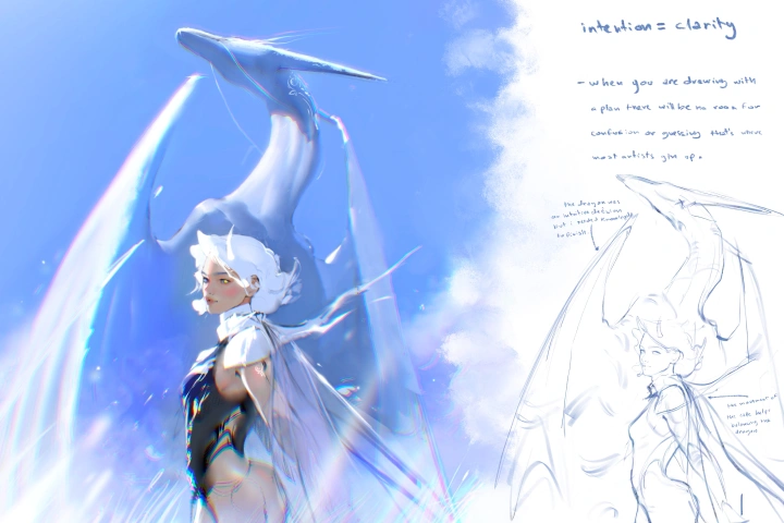
Starting and Finishing with Clarity
Move through the portrait process with a clearer sense of direction, from the first idea to the final refinement. With a practical workflow in place, you can avoid creative paralysis, reduce overworking, and bring your work to a more confident finish.